Goodbuy

Media by M-ART Production

Media by M-ART Production
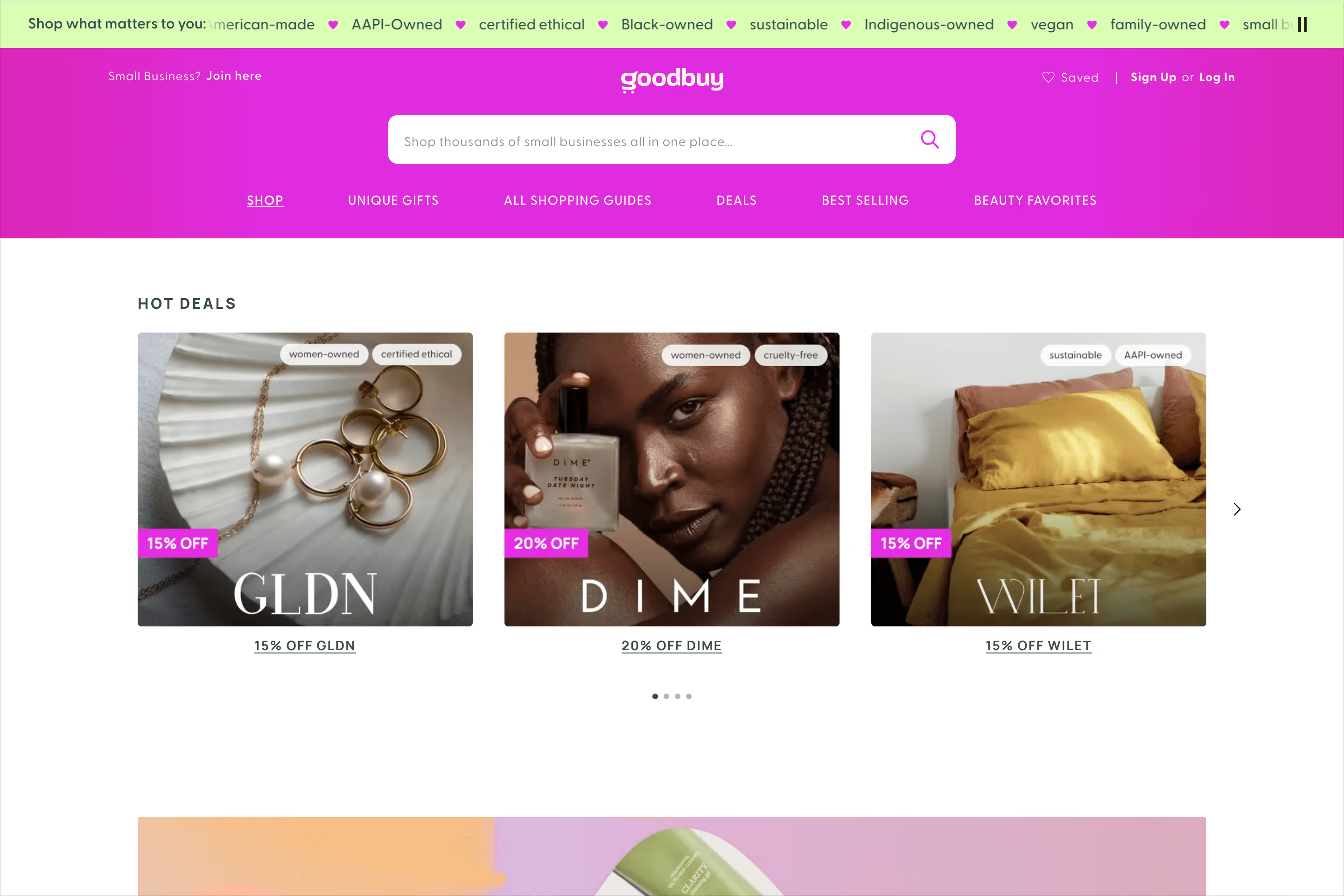
Goodbuy aims to make shopping 'feel good' by making conscious shopping easier online for consumers looking to shop their values and supporting small businesses. Think of it as a shopping search engine you can use to find products that align with your values and buy from minority-owned retailers and small businesses.
Digital Designer — Visual Design, Webflow Development
With an established shopping app and marketing website, the Goodbuy brand, genuine in its authenticity, needed more ways to express itself. Landing pages and microsites for a fast-moving eCommerce brand are a recurring channel for expression.

Goodbuy was looking to engage small businesses on Shopify. They needed to showcase the benefits of becoming a small business in their network, such as boosting their sales and scaling their acquisition.
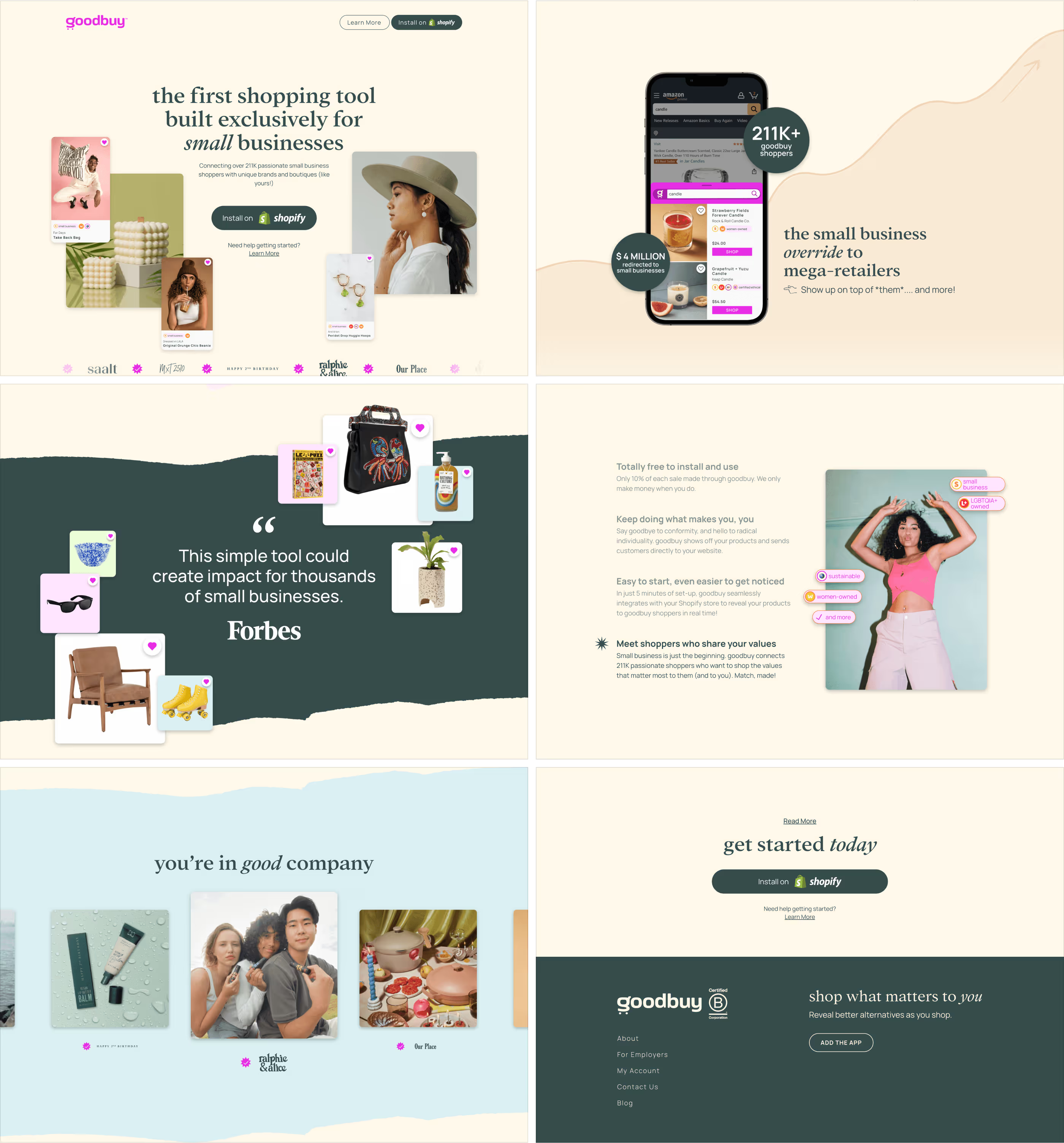
The experience was dynamic and illustrative. We used floating elements and parallax effects to provide depth and create organic compositions. The call to action was clear and featured in the hero and outro of the page. Using an established brand made it convenient and built trust.

Before having their landing page, Goodbuy had onboarded just a few businesses. Now, they have over 1,500 brands successfully onboarded to their marketplace. The experience allowed these users to see the validity of what Goodbuy was offering and saved their team from redundant communications. More than a year after the launch, the team still pushes users to this page and sees a high conversion rate.
In addition to building the landing page visually with Webflow, we follow the standard best practices for SEO, including performance, speed, semantics, and asset production.

With conversational experiences becoming more familiar, Goodbuy saw an opportunity to serve its audience with a relaxed approach to chatting about gifting ideas and products that will be perfect for each occasion.
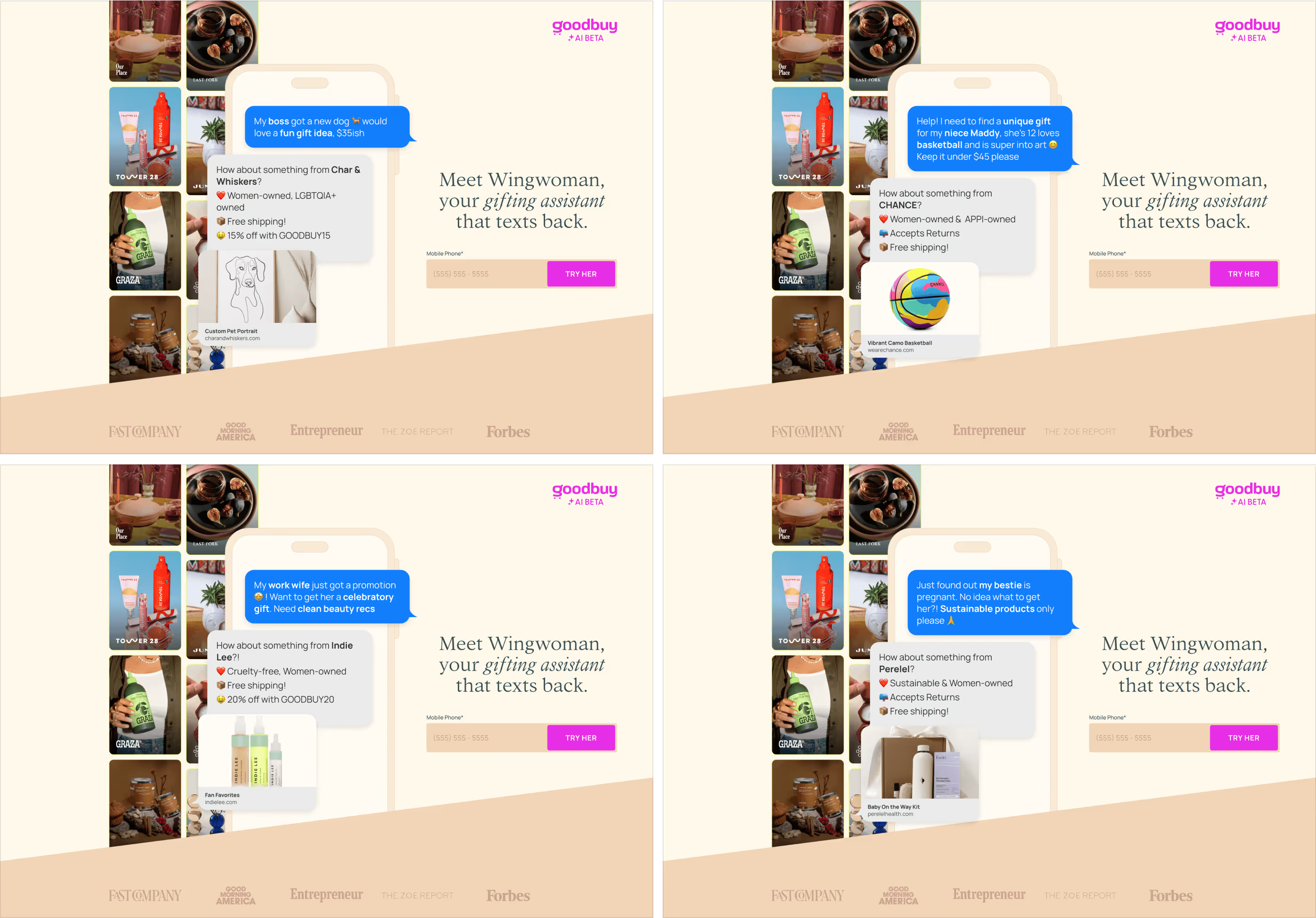
The design was very straightforward. The hero had a preview of the product with a few samples of prompts and results. They were animated in the phone's chat interface. Behind, a subtle banner with featured shops showcasing their products and brands. The call to action was a text field for their phone number, and the action was an invite to try it.
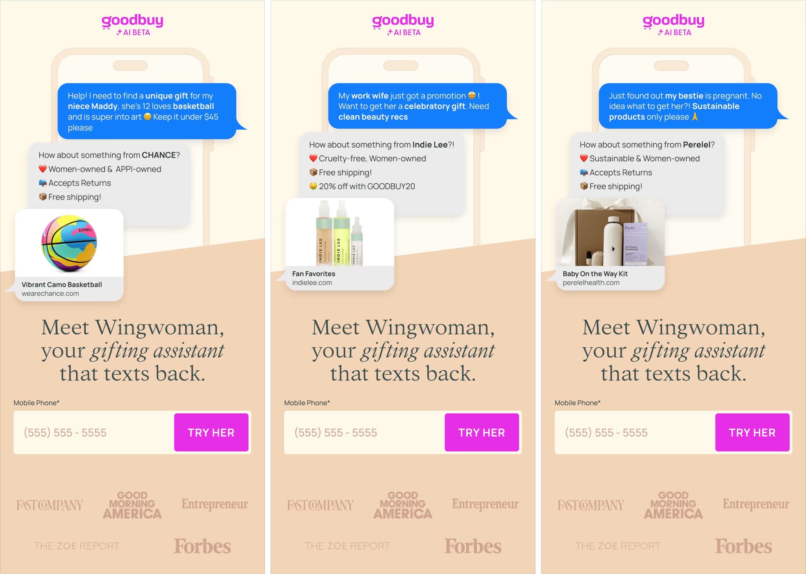
The campaign's primary target was mobile users. The experience was as dynamic as the desktop version. The action must be above the fold to keep engagement equally high, and the banner must be hidden to avoid looking busy.
Once again, we built the landing page visually with Webflow.

Goodbuy was motivated to provide alternative channels to empower its user base to explore gifting options engaging and immersively. They wanted to create a digital Holiday Catalog microsite to serve as a resource for shoppers. We were on a very short timeline for this campaign and needed to complete the microsite with enough time to distribute it before the upcoming holidays.
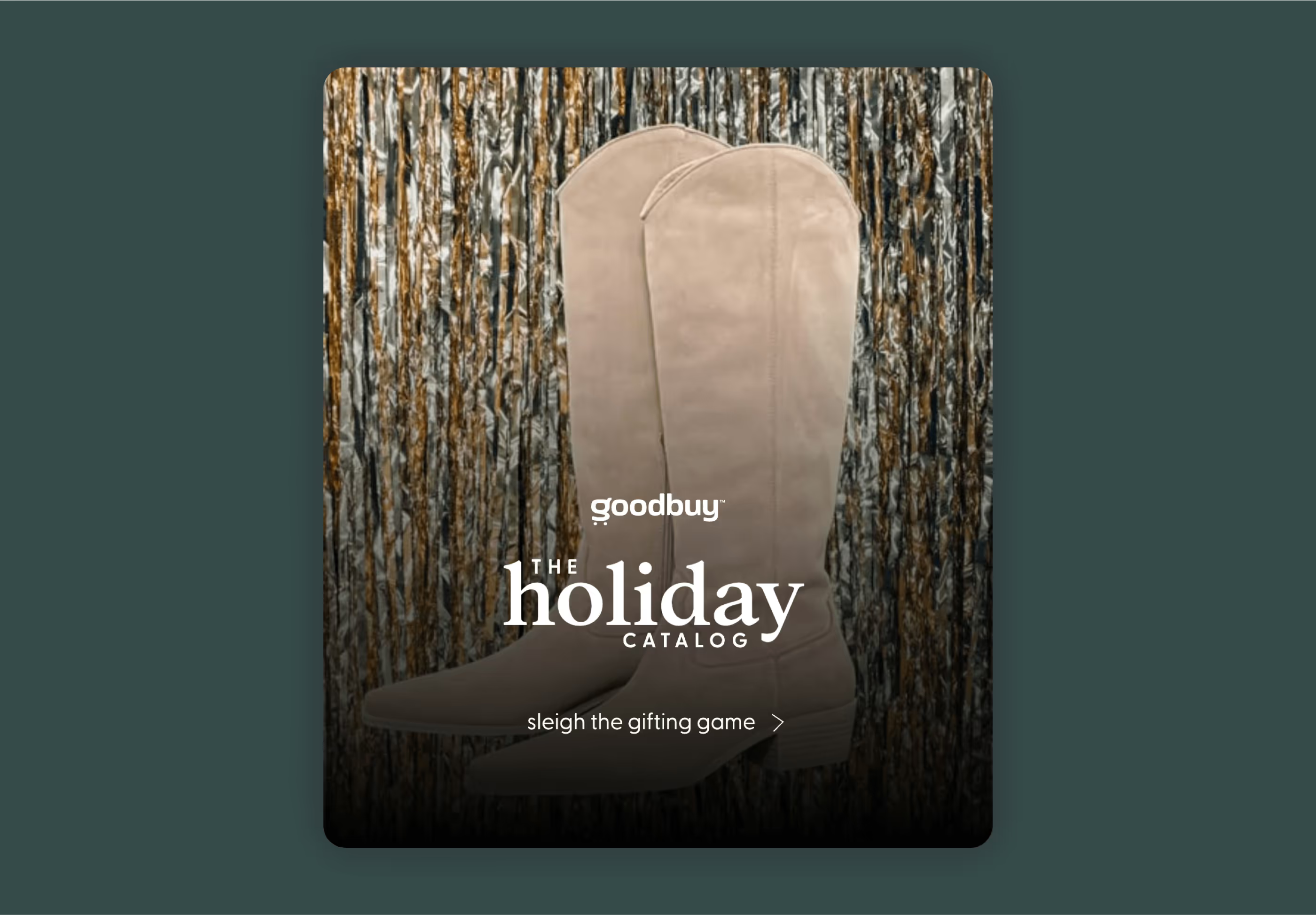
Taking inspiration from a standard print catalog, we wanted to bring the experience of visually rich layouts to the digital world and take advantage of the interactivity and motion the new medium will offer. The microsite starts with a splash screen like a cover page with videos rotating products and shops with creative transitions like a scrapbook.

The navigation was critical to the experience. While we aimed to make it as familiar and straightforward as possible, the goal was to keep it seamless. It should adapt to the context of each screen to provide navigation shortcuts and easily dock to make minimal friction. There will be floating actions linked to functionality on the core app and a menu working like a table of contents to serve as an index.
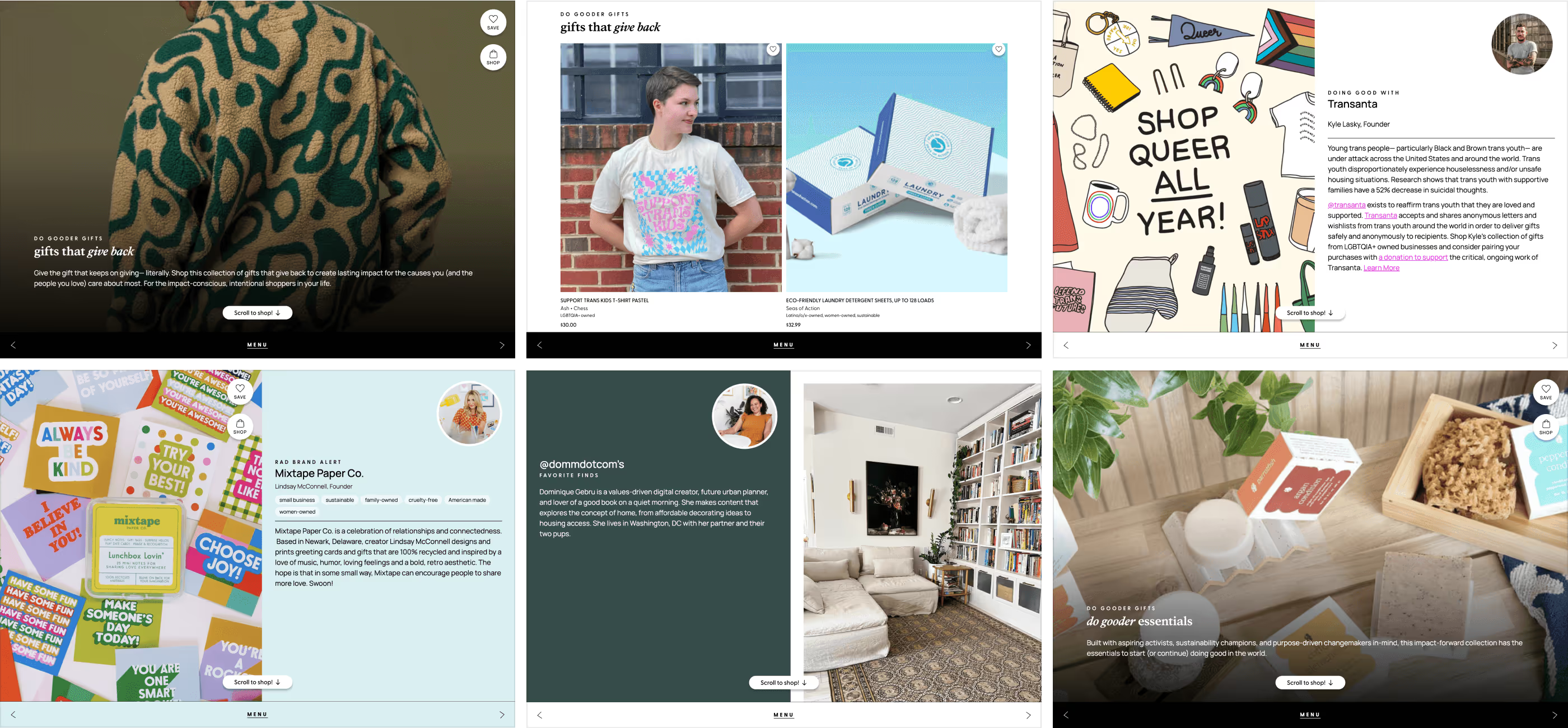
The catalog features 40+ curated collections, highlights more than 20 small business owners, and even features several Instagram Influencers. The collections will be chapters and cover topics or categories. Shops and influencers will have similar layouts but feature custom-related products.
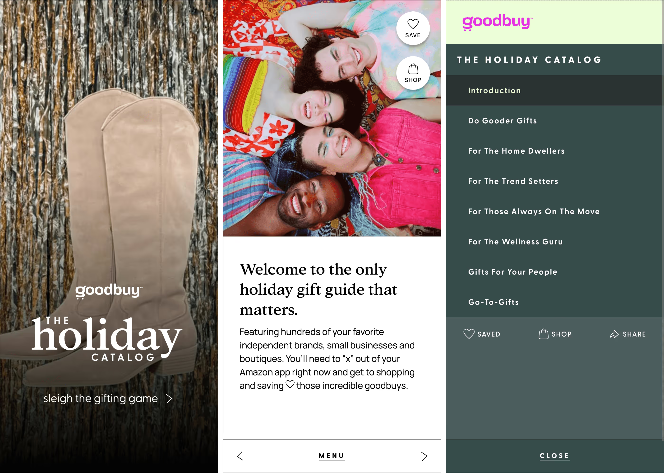
We created a unique experience that pulled in custom API from Goodbuy's marketplace. This functionality allowed us to leverage revenue from the most engaged shoppers. The products here will be handpicked directly from the Goodbuy platform by the team, featured shops, or influencers on the page.
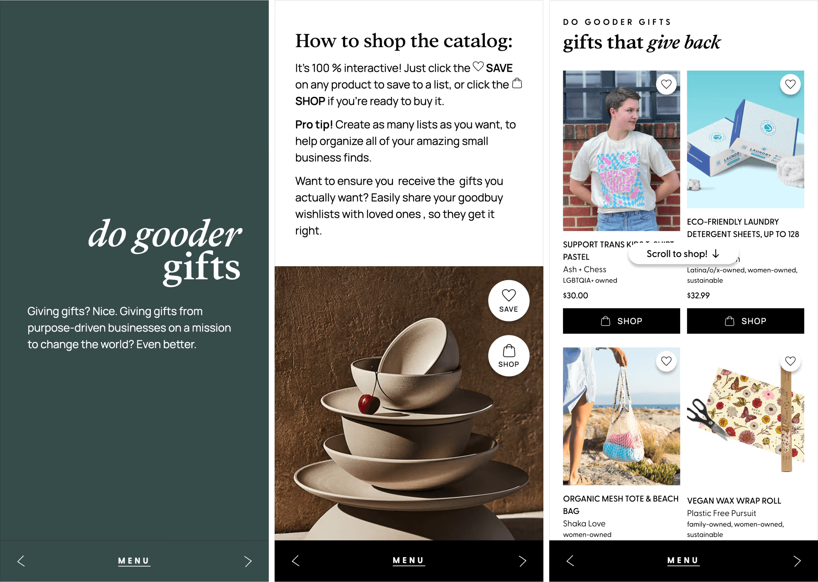
The experience was available on all screen sizes. However, the design focused mainly on mobile users, making the layouts more natural. We added generous tapping areas and diverse gestures to keep it friendly and engaging.

This was a massive project to tackle. We worked together through each process step, from ideation to maintenance. The Holiday Catalog was a key component of Goodbuy's 2022 holiday season.
The microsite was built visually with Webflow, and the API calls needed to wire the app actions and pull the related products on each page were integrated.
We've worked with Max on several projects and have consistently been impressed with his work. He really took the time to understand the goals of our project and executed on a well-crafted experience that exceeded our expectations. It's clear he has a deep understanding for design and was able to bring unique suggestions, ideas, and solutions to the project. We are always working on a tight timeline and Max's quick and clear communication was key for our timely delivery.
